My feed
Premium

Please
or
to access all these features

Join our Property forum for renovation, DIY, and house selling advice.

Property/DIY

Expensive mistake

136 replies

TheRedWoman · 23/06/2016 18:05

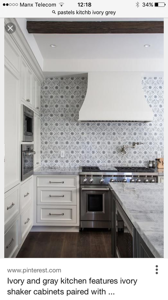
I've come on here to cry as DH isn't sympathetic at all. Dream extension / kitchen almost complete, work top installed today and it isn't what I was expecting.

It's quartz so an expensive mistake. It's much greyer in RL than the sample and just doesn't work with the units colour wise. The wall colour doesn't help, DH is currently painting various samples to find a better colour.

I am gutted. Was very nervous about getting the quartz wrong so said to DH on numerous occasions 'shall we just go for laminate, then we can change it in the future'. Apparently he thought I was joking.

Without sounding dramatic, it's ruined the kitchen. At the minute I can't see the change of wall colour helping much. I'm so cross DH didn't take my concern seriously and really consider a laminate.

Sorry, I know this is a first world problem but I just need to get it off my chest.

OP posts:
Report
PeterWeg · 18/07/2016 06:57

Agreed, I quite like it.

Report
trickyex · 17/07/2016 23:16

I think it would all blend together better if the walls were a similar tone to the units and worktop, anything bright/dark/rich will make the colour differences more noticeable.
I agree that adding colour with appliances/accessories would be easier.
A colourful roman blind and a funky kettle, perhaps go tasteful with chrome/copper? I would think about channelling the understated Devol look
www.kitchensourcebook.co.uk/2014/09/29/devols-classic-english-kitchen-range/

Report
MargotLovedTom · 27/06/2016 17:02

Woohooo! Am so glad you love it. Now considering a career change to interior designer Wink Grin.

Report
KoalaDownUnder · 27/06/2016 13:55

OP, that worktop is beautiful - the whole thing is, in fact!

I can't wait to see it 'done'.

Report
lougle · 27/06/2016 13:38

F&B Brassica looks lovely! I'm so glad this is sorted.

Report
GreyBird84 · 27/06/2016 13:13

That's the worktop I'm going for - LOVE it.

We are going for a cream shaker then grey floor tiles & lilac walls.

So I really like your kitchen but I appreciate pictures can be deceiving.

Its not nice when you get that heart sinking feeling. I hope you get it sorted into something you love.

Report
TheRedWoman · 26/06/2016 20:52

Thelovecats, that kitchen is stunning.

Thanks lightning, it's a great space and has such potential. Fingers crossed we will have moved back home in 2 weeks time. 10 weeks at my parents and counting (parents are fab, I just feel like a teenager again, disapearing to my room every evening...)

OP posts:
Report
TheRedWoman · 26/06/2016 20:45

Margot, I think you cracked it! Thank you.
After testing lots and lots of colours suggested by you lovely lot, I think we have settled on F&B Brassica. It's a gorgeous colour. I would never in a million years thought a heathery colour would work but it looks beautiful with the units and work top.

I have found some curtain / blind fabric that works really well (Laura Ashley Awning stripe in grape). So it's all coming together.

I will do a full update once everything is finished. I can't thank you all enough, I probably wouldn't be any further ahead if it wasn't for your suggestions.

LIZS, yes cooker hod (stainless steel and glass) still to go in + transparent glass splashback.

Sex, upstands are definitely staying, DH said they cost too much to rip off Grin

OP posts:
Report
Lighteningirll · 26/06/2016 19:52

Your kitchen is gorgeous I vote for a Heather colour on the walls if you want to change and a large glass of wine. I had at least three attacks of the heebies doing our kitchen and now six months on I love all of it. You've picked beautiful units, a gorgeous worktop and can change the wall colour (though I wouldn't). Also my back door doesn't open the wrong way, my freestanding range wasn't a disaster choice and my white Laura Ashly tiles do look a bit rustic not naff, cheap and nasty. The white porcelain tiled floor may not have been the best choice maintenance wise but it looks lush.

Report
TremoloGreen · 26/06/2016 15:39

A muted (greyish) blue will tie together the cream and the grey.

Expensive mistake
Report
justaweeone · 26/06/2016 12:39

I think it looks lovely, it's just not quite there
I agree with the poster who suggested painting the walls the same colour as the units and then have some black and chrome accents with accessories etc

Report
Thelovecats · 26/06/2016 12:19

Embrace the pastels- ivory and grey are perfect for that colour scheme. Alternatively, I think this looks fab

Expensive mistake
Report
LIZS · 26/06/2016 10:42

I think with good lighting , the reflection from stainless steel appliances onto work surface and strong colour accessories (teal perhaps) it will look very different. Is there a cooker hood to go in ?

Report
Batteriesallgone · 26/06/2016 10:35

glue totally agree that could look super classy if accessorised well.

Also the joy of accessories is how easy they are to change when you get bored Smile

Report
gluenotsoup · 26/06/2016 10:30

How about painting the walls the same shade as the units? I know it sounds bland, but I think at the moment the different shades are fighting with each other, and not helped by adding another colour. Then you could choose lot of accessories to lift it, with colour there. Maybe a lovely clock, a group of framed prints, a sparkly light fitting to complement the sparkly worktop, then I think it will be the timeless look you envisaged. If you Google images of high end ish kitchens, you will see examples of this. I think Tom howley kitchens show what I mean. It is lovely already, but just needs pulling together to look more than the sum of its parts if you know what I meanSmile

Report
PotatoHats · 26/06/2016 07:45

OP I totally understand why you were so gutted and I can see what you mean in the photo because the worktop stands out so much BUT it is a lovely coloured work top and I am deeply envious of the sparkles. I want sparkles if we ever move!

I echo all the paint ideas (apart from terracota - sorry whoever suggested that) - I love the heather idea, super lush. I hope you will post some pics of the different colours you are trying out so we can live vicariously through your new kitchen Grin

Report
FanSpamTastic · 26/06/2016 00:25

Hi there. Dulux has a visualiser app that you can download. You can take a photo of the room you want to paint and then experiment with different colours on the walls. You can also take photos of fabrics or the work surface and get suggested paint colours that tone with it.

Report
DameDiazepamTheDramaQueen · 26/06/2016 00:17

Sage green will sort that out plus accessories. It's beautiful!

Report
SexNamesRFab · 26/06/2016 00:07

I mean do not RIP OUT the upstands. Sorry I've had wine and am over invested.

Report
SexNamesRFab · 26/06/2016 00:06

Do not, I repeat, do not repeat the upstands. It will not change the colour of the work tops and will fanage an expensive, well fitted kitchen. The bones of your kitchen is great OP, you just need to decorate it to suit you.

Report
MargotLovedTom · 25/06/2016 09:23

Oops just seen Origami post. Yes, the heather (Dusted Damson) in the link is quite dark, so that might not necessarily be the right one when it's quite a dark space in terms of natural light, but I think the heathery tones, whether pale or intense, would look fantastic.

I've never seen the appeal of that dark battleship grey a lot of people go for, such a gloomy, oppressive colour, and I think the professionally styled kitchens up thread, with the grey and off white colour schemes, look a bit insipid (although they're obviously very smart and high end etc). It's all about personal taste though.

Report
MargotLovedTom · 25/06/2016 09:16

Is the cardboard brown, and if so won't that affect how the colours look? I've bought a roll of cheap lining paper in the past and painted squares of that when deciding between colours.

I definitely wouldn't start ripping off the upstands, and definitely wouldn't be repainting the units. I'm guessing they will have been professionally finished in the factory using spray gun techniques, and any DIY paint job with brushes or little rollers is never going to look as good. And who wants the hassle?!

I'm also irrationally overinvested and keeping my fingers crossed that you go for the heather colour I suggested Wink.

Report

Don’t want to miss threads like this?

Weekly

Sign up to our weekly round up and get all the best threads sent straight to your inbox!

Log in to update your newsletter preferences.

You've subscribed!

CauliflowerBalti · 24/06/2016 23:57

Definitely the heather colour suggested upthread...

Report
TheRedWoman · 24/06/2016 23:51

Thanks Origami, you are right, I don't think people will notice. The wall colour is the main issue. Toying with removing the upstand but concerned it will take the newly plastered wall with it. My mum has been out today and painted 6 different colour paints on cardboard for us to look at. And dad got a load of the lights in, so we may have them working by the end of the weekend. I know it will sort itself out, just hoping I like it in the end.

OP posts:
Report
origamiwarrior · 24/06/2016 20:37

Aw bless you. I've been in your situation loads of time too - carpet colour, window size, thickness of built in bookshelves, floor tile pattern and also quartz worktop! The galling thing is not actually that you have the end result you have, but is that by simply making a different decision, you could have easily had it exactly as you wanted - wouldn't have cost any extra; might even have been cheaper. Oh yes, been there lots!

You need to ask yourself: would someone coming in to the room with no knowledge of your angst actually notice? Or of they did notice, would they think it was an intentional choice? I bet if you had posted the same photo, and said 'should I have upstands or not?', no one would have mentioned the colours - you would have had loads of admiring comments. Looking at the photos that ChishandFips has posted, it would seem that your colour combination is a popular choice!

I guarantee that providing you are in that category (where no one else would in fact notice, or if they did, they would think it was your intention) then you will get used to it. I no longer notice any of the 'huge mistakes' I made (except the window size - still a little raw but that will fade!)

Keep playing around with the paints, and don't feel you need to have the depth of colour people have suggested - the heather looks really good but you can get paler/greyer heathers than the examples linked to.

Report
Please create an account

To comment on this thread you need to create a Mumsnet account.