My feed
Premium

Please
or
to access all these features

Join our Property forum for renovation, DIY, and house selling advice.

Property/DIY

Which of these colour schemes should I pick?

22 replies

AWombWithoutAFoof · 11/12/2014 10:15

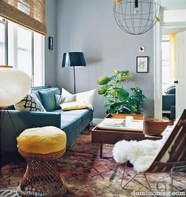
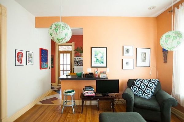
Modern house, living room with lots of light. The room's about 6m x 4m. I'm getting bewildered.

Which of these colour schemes should I pick?
OP posts:
Report
AWombWithoutAFoof · 11/12/2014 10:16

... and the last one...

Should mention that the windows are hardwood that's a reddy brown.

Which of these colour schemes should I pick?
OP posts:
Report
strongandlong · 11/12/2014 10:19

What direction does the room face? Do you have any existing furniture you want to use?

Which do you like the most? Smile

Report
AWombWithoutAFoof · 11/12/2014 10:45

It's on the first floor, with french doors that face south, looking out over fields. There's a smaller window that faces west.

We have two sofas that are the same colour as the brassica shade in the F&B pic, that purple sliver down the left of the pic. They both need to be recovered, though, so I'm not too worried about trying to match them at this point. There's no carpet at the moment, we'll be putting wood down eventually when we've saved up.

I'm not used to living in a new house, so I'm out of my comfort zone a bit. I can say I definitely don't like brown and cream/beige colour schemes.

OP posts:
Report
AWombWithoutAFoof · 11/12/2014 10:52

Sorry, realised I never answered which I like the most. The orange makes me happy, but I'm not sure how it will look against the brown window frames, and I'd think if I misjudge the shade even a bit it could be awful. Unfortunately the shade isn't listed anywhere.

I love the vibe of the room with the yellow stool, but maybe I'm being swayed by all their gorgeous stuff. Grin

OP posts:
Report
TremoloGreen · 11/12/2014 12:21

I really like the first one. Your sofas and floor will fit into that kind of scheme much better.

Report
AWombWithoutAFoof · 11/12/2014 12:35

Is that the yellow stool one? The photos are in a different order on my laptop compared to my phone.

OP posts:
Report
TremoloGreen · 11/12/2014 12:37

yep Smile

Report
HeyMacWey · 11/12/2014 12:39

I like the first one too. With the yellow stool.
All the pictures are of period houses though. Perhaps try looking for more modern pictures for inspiration? It's hard of you've lived in an older house though.
Could you paint the window frames?

Report
BlueBrightBlue · 11/12/2014 12:52

I like number 3

Report
ChristmasName · 11/12/2014 14:04

I like the first one best, and it should look good with the window frames.

Report
lovingmatleave · 11/12/2014 14:32

blue or green one. the orange is too like terracotta from the early 90s.

Report
AWombWithoutAFoof · 11/12/2014 18:54

Hhm, looking like votes are going the way of the blue one. I don't think I want to paint the window frames, but am going to paint over the acres of orange knotty pine skirting boards and banisters etc.

Right, now to find out what colour this is, or at least what I could use. I've seen some nice pics of F&B Oval Room Blue, but that might be a bit too dark compared to the pic.

OP posts:
Report
Lelivre · 12/12/2014 09:38

Do come back when you find out the paint for the first pic. It was my favourite too.

Report
AWombWithoutAFoof · 12/12/2014 10:53

I've got a tester of Farrow & Ball Parma Grey drying at the moment, and it's looking very similar. It seems an odd colour in that online in some pics it looks very grey, and others it's pale blue.

OP posts:
Report
Lioninthesun · 12/12/2014 22:54

I like the first blue/grey one. I think perhaps depending on the light and time of day you will get a blue tint or a grey. I am looking at something similar at the moment and bemoaning that most paints on Houzz seem to be American. I was looking at Parma Grey as an option so do show us how it turns out!

Report
Lioninthesun · 12/12/2014 23:06

This site is quite good for colour schemes, and this is the one I am looking at for a similar property to yours (modern, loads of light and 2 sets of French doors) design-seeds.com/index.php/home/entry/color-fresh2
I was wondering if it's worth colour matching some paints from but seem to remember seeing on here that it doesn't usually work out well or cheaper than F&B. Valspar's Sea Foam was one I wanted to try - on the ceiling here www.houzz.com/discussions/62219/what-paint-colors-are-the-blue-and-tan-used and they do seem to have a fairly vast selection of blue/greys!

Report
NoRoomForMarysFoof · 13/12/2014 09:01

Back again under my Xmas name change.

The Parma Grey looks lovely. I'm just debating whether to get it colour matched or whether to buy F&B. I'll be painting the room myself, so will try hard not to skimp on prep, but I wonder whether it's worth shelling out on F&B given an amateur's applying it. There are several MN threads on this, but I still can't decide!

Report
Lelivre · 13/12/2014 15:00

I don't know about F&B but I tried to match a fired earth paint (which is amazing stuff coverage wise by the way) and couldn't get it right and I ended up wasting money on other samples and getting the FE paint anyway!

Report
Lioninthesun · 13/12/2014 15:21

Can you get a tester pot of colour match or do they make you buy a huge tin?

Report
Lioninthesun · 13/12/2014 15:45

The paint I was hoping to find was a Benjamin Moore - you can see a lot of the lovely blues here www.houzz.com/blue-benjamin-moore but you can't get it in UK. OP could you post a pic if you do decide to use the Parma? Would love to see it!

Report
kayessbee · 19/12/2014 21:40

The only way you can truly colour match a paint is if you have the code, which is not possible. If the colour match system misread the red content amount, for example, this would change the tone considerably, and not look as you expected. If you like the F&B colour and have tried it in all lights & in the darkest corners and the brightest spots, then go for it, I'd say.....and read lots about painting and prep!

Paint up a few pieces of paper (sketchbook weight is better) first and pin them around the room to see how they all look at different times of the day - masking tape them all four sides to a table top before you paint - keeps them flat, bumpy paper is not only annoying but is also not a true reflection of how it'll look on the wall....

Report
AWombWithoutAFoof · 31/12/2014 16:59

Well, the match is great, only a tiny tiny bit away from the F&B shade. Obviously that would be a pain if you were matching something you'd already painted, but for me it's fine.

The only problem is, now it's on the wall, I'm not sure I've made the right choice... Bugger.

OP posts:
Report

Don’t want to miss threads like this?

Weekly

Sign up to our weekly round up and get all the best threads sent straight to your inbox!

Log in to update your newsletter preferences.

You've subscribed!

Please create an account

To comment on this thread you need to create a Mumsnet account.