My feed
Premium

Please
or
to access all these features

Join our Property forum for renovation, DIY, and house selling advice.

Property/DIY

Help choosing a colour for kitchen cabinets: blue/green/grey (F&B)

36 replies

LeeMiller · 16/05/2016 09:24

We have decided to paint our own kitchen cabinet doors. We will either paint ourselves or ask the carpenter making the doors to paint them for us. The consensus seems to be that Eggshell is the best finish. We are in Italy where the 'eggshell' finish is not a thing so the choice is limited: Farrow & Ball eggshell or 'Fleur' (also water-based).

I am feeling overwhelmed by the choice of F&B colours. We'll order samples but I can't afford to order half the chart! So I would really appreciate it if anyone with experience/excellent taste could help me narrow the list down... We like blue-green (not too apple-y) or blue-grey: fresh, not too 'country' and warm-toned. It's a south facing room and will receive strong Mediterranean sunlight.

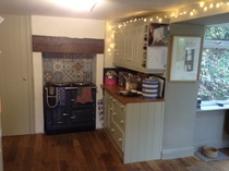
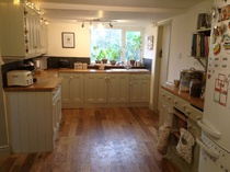
Other relevant info: floors are oak, work surface is oak butchers block, white farm sink, white tiles and white walls (Pure Brilliant), shaker style doors, brass handles. Cabinets only on one wall (base cabinets with a couple of wall cabinets over the sink) so not dominant - other furniture is wooden or off-white. Room is small so we'd like something quite subtle that doesn't feel heavy but still has enough contrast with the tiles and sink to prevent blandness, and which doesn't make the oak look orangey.

If you're still reading, any thoughts on the following?
Pale Powder (possibly our first choice but I'm worried it would pull too white/green)
Teresa's Green
Borrowed Light
Light Blue
Blue Grey
Cromarty
French Grey
Purbeck Stone
Pavillion Grey
Mizzle
Vert de terre

I've ruled out:
Hardwick White (too white)
Parma Grey (too blue)
Pigeon (too dark and murky)

OP posts:
Report
foreverhome · 16/05/2016 10:48

Pinterest is great for this kind of stuff >

I like Pavillion Grey with the white tiles/oak worktop...
uk.pinterest.com/pin/469570698628220628/
uk.pinterest.com/pin/359654720221071045/

Also Mizzle...
uk.pinterest.com/pin/515732594805866133/

But I think my favourite is the Vert de Terre...
uk.pinterest.com/pin/464293042813775441/
uk.pinterest.com/pin/309200330641680769/
uk.pinterest.com/pin/531565562241836917/

Report
saltwiththat · 16/05/2016 10:57

Mine are painted Lightblue22 & I'm very happy with them. The walls are Blackened.

Report
LeeMiller · 16/05/2016 17:50

Thanks forever! Pinterest is like falling down the rabbit hole. I lose hours! The mizzle is very nice in that photo. The vert de terre is maybe a little warmer than I would like when paired with the oak.

Salt, how does the light blue look in sunlight? In some photos it's very green. Also, can I ask whether you painted the copboards yourself, and if so, how they've held up?

OP posts:
Report
saltwiththat · 16/05/2016 17:59

Light blue looks pale grey/blue in sunlight & green/grey at night.
I didn't paint them, the kitchen bloke did it but I saw the F&B paint. I've had it 2 years and there's one scuff on a kick board where I bashed it with a hoover. I just wipe them down with random kitchen spray and a microfibre cloth.

Report
Hufflepuffin · 16/05/2016 18:13

We have mizzle in a bathroom with oak floors and work top. It's a perfect greedy grey neutral and looks different in different lights. I love it a lot.

Report
Hufflepuffin · 16/05/2016 18:20

Greedy = greeny!

Report
LeeMiller · 16/05/2016 18:35

Thanks salt. I think light blue will have to be one of my samples. The boring name was putting me off as I relaly don't want a baby/sky blue, but it sounds like the colour is nice and complex. That's reassuring to hear about the finish too, there are lots of F&B naysayers out there.

Mizzle is nice isn't Huffle... I was worried it was too dingy but it's growing on me. Do you think it would look too heavy on upper cabinets? And is it a moody overcast skies kind of colour or does it look good in bright sunlight?

Any love out there for Pale powder/Teresa's green?

OP posts:
Report
Butwhereto · 16/05/2016 19:23

Embarrassingly I have testers of or almost all of these on the walls.

In my house...borrowed light is a baby powder blue, miles lighter than hardwick white if that's too light. Blue Gray is a pretty true green in my south facing dining room, no blue and only a touch of grey. Mizzle is nice, it is not dingy even when it's dingy weather. Cromarty is like a minty lighter version of mizzle.

Pale powder is nice, I have it in a bathroom. It's light and fresh and a pastel aqua with a hint of blue but might be a bit washed out in constant very bright sunshine.

French gray and blue gray are similar in depth of colour, there would be a real contrast against white. Light blue is similar but in my house looked the lightest of the three at night, rather silver greyish and a true blue grey during the day. On lots of Pintrest pictures especially kitchens they all look lighter than they do in my house even though the rooms are south facing. A whole room in French gray looks quite dark to me.

It's so tricky to decide. On the finish point I previously had sprayed lacquer kitchen units in Shaded White, it had a fair few scuffs and knocks after a couple of years. Next time I would get hand painted. It will chip but the touch ups will maybe look better than on a factory painted finish. The "spray" touch up paint doesn't last I found once it was opened. The colour match was perfect but after a year or so it got a bit like tipex.

Report
RaisingSteam · 16/05/2016 19:31

Can you get Little Greene in Italy (Website suggests a couple of stockists)? Unlike F&B they still do an oil-based eggshell which is nicer to paint with and more durable than water based eggshell, very matt. They have a similar collection of lovely colours. Pearl Colour IIRC is light green-blue-grey.

Report
LeeMiller · 16/05/2016 20:26

RaisingSteam - There are no Little Greene stockists near us. LG do deliver online to Italy but I'd prefer to avoid it as once delivery is added it would work out quite a bit more expensive than buying F&B (already not cheap) from our local stockist who will do us a deal as we're buying lots of stuff from him... then there's the inconvenience of taking time off work to wait in for couriers/driving miles to the depot to collect it and having to go through the same palaver for samples, paint, possibly more paint if we underestimate the quantity.... so unless it's MUCH better I'd rather go with F&B... don't want to regret it though...

OP posts:
Report
LeeMiller · 16/05/2016 20:31

Butwhereto thank you! that is super helpful! the blue-green-grey spectrum is lovely isn't it?
Is Blue Green also very dark? And Cromarty is minty? I though it was greyer (like a pale Mizzle?) from the website... sigh. And perhaps pale powder could be too pale and toothpastey for kitchen cupboards in a sunny room?

Teresa's green anyone?

OP posts:
Report
Hufflepuffin · 16/05/2016 20:47

I'm not much help because I think mizzle is the perfect colour for pretty much everything. It's definitely not heavy at all, it looked nice on a chest of drawers in our old very bright flat. It's kind of dingy in the muddy sense - in that it has more depth than a pastelly duck egg blue or green. I think it's far enough from a pure grey that it won't look dated like some very trendy greys.

Report
LeeMiller · 16/05/2016 21:02

Thanks HufflePuffin! Mizzle looks SO diffefrent in different pictures... hard to believe it's the same shade. I need a sample don't I.

OP posts:
Report
BumbleNova · 17/05/2016 09:22

we have been buying lots of samples of F&B and Little Greene at the moment and honestly, LG is so much better in terms of coverage. even doing samples, the F&B paints needed two or three coats to get a good even colour whereas the LG looked great with one coat.
needless to say we are going with LG.

Report
Zampa · 17/05/2016 09:26

My kitchen is in Cornforth White but this is more of a warm grey so maybe not what you have in mind. Hopefully you can see the image attached.

Walls in Wevet.

Help choosing a colour for kitchen cabinets:  blue/green/grey (F&B)
Report
LeeMiller · 17/05/2016 09:39

Zampa your kitchen is lovely. Very restful! I wonder if the Cornworth White would be washed out in bright light though. In many pinterest pics it looks much whiter. I wish I could afford samples of everything! Did you paint it yourselves and have you had any problems with scuffing/chipping?

BumbleNova that's useful feedback. I would so much rather go with F&B for practical reasons. But the rave reviews for LG are giveing me pause for thought.

Has anyone used the F&B Estate eggshell specifically?

OP posts:
Report
Kitsmummy · 17/05/2016 09:53

This is my kitchen in Bone with Wimborne White walls. It's a fairly dark room and the Bone looks greeny/grey, I love it

Help choosing a colour for kitchen cabinets:  blue/green/grey (F&B)
Report
CopperPot · 17/05/2016 09:57

Pidgeon

Report
CopperPot · 17/05/2016 10:00

Sorry stupid phone. Pigeon is really nice

Report
Abraid2 · 17/05/2016 10:04

I have F& B purbeck stone on kick boards in my kitchen. It is quite a task to paint,p with it, much harder than with other eggshells. Perhaps because it's water based.

Sadly, it has scuffed a bit where it has been caught by a vacuum cleaner but I managed to retouch.

I have F&B skimming stone eggshell on most of my skirting boards. It is lovely, but again, needs more care to paint with than other eggshell paints.

I wouldn't paint the cabinets myself. Big, big job.

Report
LeeMiller · 17/05/2016 10:20

Bone is very pretty (as is your kitchen) Kitsmummy. I wonder if it would be too washed out in a bright room.

How dark does pigeon look in real life copperpot? It seems to vary wildly in photos. It's beautiful though.

OP posts:
Report
Kitsmummy · 17/05/2016 10:22

And yes, I painted the cabinets myself with f&b eggshell and primer. This was about 6 months ago, no problems with durability so far

Report

Don’t want to miss threads like this?

Weekly

Sign up to our weekly round up and get all the best threads sent straight to your inbox!

Log in to update your newsletter preferences.

You've subscribed!

LeeMiller · 17/05/2016 10:23

Abriad, how is it hard to paint with ? difficult to get a good finish? Did you use the F&B primer? Gosh it's so hard, I always though paint was paint... We could spray if that would make a difference.

I'm not worried about the time element (teachers so lots of time in summer) but I don't want to go to all the effort/expense for it to look crap. Rustic style scuffing would be ok I think, but not ugly chips...

OP posts:
Report
Kitsmummy · 17/05/2016 10:23

I started to paint the adjoining room walls in Bone but the room is much brighter and yes it did look washed out, almost like an apple green, bleurgh, so I had to go a shade darker.

Report
Abraid2 · 17/05/2016 11:26

traditionalpainter.com/farrow-and-ball-paint

This guy is who you want to read.

I used a primer recommended on his site, I think. It is really worth having a look at what he says,

Report
Please create an account

To comment on this thread you need to create a Mumsnet account.