My feed
Premium

Please
or
to access all these features

Home decoration

Going dark in a dull room

35 replies

FactsAreNotMean · 14/10/2019 09:24

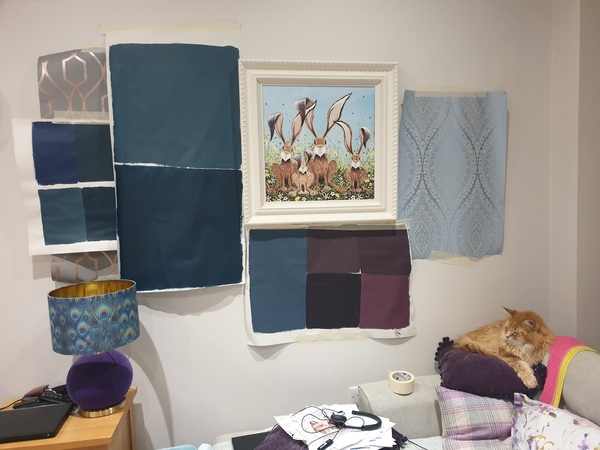
I'm currently sitting in my livingroom surrounded by wallpaper samples and painted bits of lining paper trying to decide what to do.

We have a west facing livingroom/diner, about 18ft by 10ft. The house is Victorian with lots of period features but this room is a modern conversion so is a bit lacking on that front. It's west facing, but because there's houses directly opposite and quite close (mews street) we don't get much direct light at all - the roofs opposite block the sun by about 3 most days.

Has anyone braved going dark in a room like this? I'm not scared of colour (the kitchen is a bold teal, hallway is a purple colour) but I've always tried to maks this room light and I feel like it's a losing battle. For 7 years it's been various shades of cream, taupe etc, currently with a pale duck egg on the end wall and it just looks utterly meh.

I'm looking at a large sample of dulux Azure Fusion 1 and I really like it. I'm seriously considering putting it either all over, or on 3 walls with a paper on the end wall but one which is the same colour of background. Has anyone gone dark in a room like this?

I feel like maybe I should stop fighting the darkness and go for making it really cosy and luxurious instead?

OP posts:
Report
Maydayredalert · 14/10/2019 22:15

Yes, absolutely!

My house backs onto a big wood and has very little natural daylight. The previous owners painted those rooms red, and while I was a little unsure at first it really works nicely. It always feels warm and cosy. With my rooms at least, even if they were painted white they'd still be dull, so we may as well embrace the darkness.

Give it a go!

Report
FactsAreNotMean · 15/10/2019 07:08

Thanks. That's my feeling too, that I'd be better embracing the dull and making it cosy. I managed to pick up some gorgeous silk for curtains so I'm thinking either very very deep teal (it's almost like hague blue but a tad more intense as my room kills all the subtle tones) or a deep aubergine like pelt, lots of metallic accessories, silk curtains, nice rug, i already have a few nice artworks which I can see stand out so much more against the deep samples.

DH is not convinced Grin

OP posts:
Report
Ginfordinner · 15/10/2019 07:11

No. It won't feel "cosy". It will feel dark, depressing and claustrophobic.
Sorry.

Report
DoraNora · 15/10/2019 07:21

I also have a living room like this, we painted it a dark greeny-grey colour. It looks great and has a nice ambience now. Also we get a lot of compliments Grin

HOWEVER it remains 'cosy' in summer and therefore I don't particularly like it in the daytime in summer. Of course it wasn't nice when it was dull and white, but some people say 'if you painted it white it would be better'. It's not, it's then dingy all year round but if you're like me these comments will get your back up so prepare for them!

Good luck!

Report
averythinline · 15/10/2019 07:25

I think dark like brinjal/hague blue or colours with a black/grey tone could be gloomy rather than cosy unless you go warmer shades ....so deep and rich rather than dark for dramatic - much as i Love Teal its quite cold...
so red /pink/gold/warm tones so in fb as victorian house - how about rectory red?
or green -for a different feel Bancha? or Yeabridge ....

Report
FactsAreNotMean · 15/10/2019 10:11

Sounds similar Dora- we don't get much sun even in summer tbh but I know what you mean

I have used red before, but the kitchen is directly off the livingroom and painted a bright teal so the clash would be pretty bad.

When i looked again this morning I quite liked the mysterious teal which is the top one of the large patches on the left. Excuse the mess...

Going dark in a dull room
OP posts:
Report
FactsAreNotMean · 15/10/2019 10:16

Should also say I really don't like yellow tones or pale greens - I'm a winter so jewels colours and dark and mysterious is my kind of thing. Emerald, amethyst, sapphire, teal, magenta etc are all colours I love. Pastels...not so much. Which is a challenge decor wise

OP posts:
Report
peachgreen · 15/10/2019 10:19

We have a very dark living room which doesn't get much sun at all. We painted it dark navy and it's gorgeous. Cosy in winter and cool in summer.

Report
Seeingadistance · 15/10/2019 13:37

Good to see the cat getting involved!

I’m a winter too, and share your colour preferences.

The purples do seem a bit warmer though. I’d take that lovely lampshade as inspiration, and use the colours in that along with flashes of warm metallics for highlights.

Report
Seeingadistance · 15/10/2019 13:40

Maybe the appeal of the lampshade, and base, is the pattern and texture as much as the colours. Thinking about it, maybe you need to stay away from large expanses of plain colour as they’ll make it duller.

Report
AdalindMeisner · 15/10/2019 13:51

I like the large wallpaper sample and the colour of the lampshade but the dark colours are not nice for a dull room.

Report
StillSmallVoice · 15/10/2019 14:00

DD has just painted her small dark front room a dark, Jewel-like green. It looks absolutely lovely. It glows a bit where the light hits the walls and has interesting shadows which change during the course of the day. It's positively glamorous.

I'd go for it.

Report
FactsAreNotMean · 15/10/2019 14:35

Funnily enough in the true light of the room the big paper sample looks very icy, it's really hard to capture light!

I do love that lamp though, it's definitely staying. As is the cat!

OP posts:
Report
Ruby2065 · 15/10/2019 16:58

I don't think you'll really know until it's done. Our bedroom is painted in that dark blue colour you've shown and looks great because our furniture kind of fits in with it - antique rich brown and we have colourful killim rugs scattered around. Otoh we painted our dingy north facing dinning room a rich dark matt red - looked great at night with the log burner on and twinkly fairy lights etc but during the day, particularly an overcast one it felt cold and depressing. We recently had it decorated with a very light green floral patterned wallpaper and it actually looks much nicer !

Report
FactsAreNotMean · 15/10/2019 17:16

I think you might be right tbh. We've had this room nearly 7 years now and despite really enjoying interior design I don't think I've ever really liked it. It's been a warm cream, a taupe, had a magenta wall, a duck egg wall, 3 different pairs of curtains ranging from very heavy chenille stripe to duck egg floral...

This is unusual for me.

I am waiting for a bit of this wallpaper to turn up - yes it would only be a feature wall! Our window (useless as it is) takes up almost a whole wall too.

Going dark in a dull room
OP posts:
Report
pallisers · 15/10/2019 17:20

We have a small living room which doesn't get much light (despite lots of windows). We painted it a deep navy - quite like the colour on the bottom square to the left of your painting. We do have bookshelves on 2 walls that are white so that adds some light. I love it - it is my favourite room.

Report
cluecu · 15/10/2019 18:00

We have a West facing lounge which is very dull most of the time. Painted it in dulux denim drift and love it! So cosy but it's also a pretty colour so works in daylight with pinks, whites, coppers. Smile

Report
Maydayredalert · 15/10/2019 21:26

Another who thinks you just won't know until its done!

I LOVE that wallpaper. Go for it! You can always paint it white if you don't like it and start again!

Report
TiddleTaddleTat · 16/10/2019 08:07

It sounds like you've already experimented a fair bit over the years and so you have a good idea of what does and doesn't work...
In our similar west facing living room we wanted to go quite dark initially (eg. Hague blue) but in the end went for a warm toned mid blue (little greene pale lupin) with warm toned woodwork and ceiling (slaked lime) and it's lovely in the afternoon as we get sun on it and it feels so warm and cosy.
I guess if you don't get much sun in there I would try and push for a colour with a warm undertone and some very good lighting.
Btw even if you're not buying from them little greene offer a free colour consultancy service - you can find the number on their website and call with your query. That's what we did and was how we chose our colour combination in the end.
Might give you the confidence to go for it!

Report
SeekingShade · 16/10/2019 09:29

How about something like F&B Lichen? I had it in a windowless hall and it got loads of compliments. I also think the proportions of the room might be making it feel 'off'. Do you have enough ceiling height for picture rail? It tricks your eyes into thinking the ceiling's bigger and hence makes the room feel wider.

Report
FactsAreNotMean · 16/10/2019 09:47

The proportions definitely don't help - neither does DH using the dining table (which is at the far end of the room, away from the window) as a dumping ground! Makes it feel like there's a dead corner. Currently looking at some sort of floor lamp for that corner to try and improve it a bit as I think it would be better if it had different lighting to define it as a space in its own right.

Between that and his huge TV (I'm in on my own today, the TV will not be turned on at all as I never watch it)...my house would be so much nicer if I didn't have to share! Grin

OP posts:
Report
Nettleskeins · 16/10/2019 20:21

We have a darkish westfacing living room. We had very rich heavy patterned blue curtains with a touch of greens and pink in them but basically a dark teal blue. Wooden floor (pine) aquamariney sofa, red tiled fireplace with dark pink marble, and white walls (a slightly aged white but not cream) Lots of books and some brown furniture, rich pictures with gold frames. Tbh it always looked great in winter but a bit heavy in summer with those teal patterned curtains. (which were beautiful in themselves)
We transformed the room by making the furniture lighter toning shades of green and rust and blue, and having curtains which matched the walls (aged white colour, definitely not peachy or magnolia) "Calico" by Romo. Now we have a jazzy Ikea rug with touches of orange and teal and brown on the floor, the walls are exactly the same colour as before(aged white) and it looks lovely all year round. Edwardian house.

I suppose what went wrong before was it was all a bit heavy and the matchy matchy aspect never worked. Now it is eclectic but the white walls and white curtains (not brilliant white you understand) pull the eclectic bits together. Patterned curtains and feature walls don't really work unless the rest of the room has nothing in it.

Report

Don’t want to miss threads like this?

Weekly

Sign up to our weekly round up and get all the best threads sent straight to your inbox!

Log in to update your newsletter preferences.

You've subscribed!

Nettleskeins · 16/10/2019 20:23

Emin Calico by Romo were the curtains, and the paint colour was Historical White by John Oliver now discontinued but prob very similar to a blackened white from Farrow and Ball..Pointing??

Report
FactsAreNotMean · 16/10/2019 22:13

The paper samples turned up today and the birds paper (picture upthread) is really lovely and a pretty perfect match to the Azure Fusion 1 paint so I think I'm going to go for it. If I hate it then I'll pick out one of the pink shades from the paper and change the rest of the walls to that (as nothing else I'm doing would clash with pink).

DD and I have spent today moving the samples are the room, playing with lighting and so on. In theory the wall colour we have now should be a brilliant backdrop - it's very soft - but we found that the darker colour seems to make whatever we put it beside look amazing. Pictures, pretty vases, nice mirror which all seem to be a bit invisible just now suddenly seem to take centre stage against the darker colour. It's odd, and it'll be interesting to see how it looks once it's done!

I am going to town on lights though! Two new floor lamps and a little one to sit on our shelves, plus some new mirrors which will sit almost directly opposite the existing one with a lamp below them - hopefully this will create lots of interest.

OP posts:
Report
Milkstick · 16/10/2019 22:33

We did this in a low ceilinged, beamed, dull living and dining area and it really does work. It's counter intuitive because we think white bounces light but dark colours give depth and can make a room feel richer and less claustrophobic. My husband went on and on about this (he has an art based job and spends a lot of time with light and colour) and I just let him have at it. Deep dark blue here. Everything really does pop. We have touches of colour, yellows, greens and a dark red rug and it looks much more right than it did when the walls were light. Also, plants look REALLY good against dark blue. :)

Report
Please create an account

To comment on this thread you need to create a Mumsnet account.