Hi@dontcallmelen, I am very drawn to Dropcloth, and I still haven't ruled it out, but the tester pot came up very yellow against my hideous orange floor. I would like to use Dropcloth somewhere though - it's a great colour.
Your hall sounds great - I don't have one at all (front door straight into living room - ugh) so I'm busting with envy. So it sounds like you've got a pale bluegrey theme going from hall into kitchen, with warm neutrals in your living room? When you say mushroom do you mean grey or greige?
I would start by deciding what colours will be staying (the hall and kitchen units?) and then use that as the basis for pulling together a palette of colours. The Farrow and Ball website has that really useful bit on each paint colour page where they show you what colours go. I'm not one for moodboards but when planning my downstairs I basically got hold of one of those F&B swatch sets (cost me fifteen quid a few years ago and has dramatically cut my tester pot bills). Think about contrasts as well as toning colours: my palette is basically storm colours (greys, blues, greens) with burnt orange and mustard highlights.
Then think about how you want to play with light and dark. All your rooms sound medium to pale at the moment - do you want to take one darker? Normal would be living/dining room but that's not a rule. If you take this route, it's easy to flip your palette so the darker shades predominate in one room (with lighter/brighter highlights) and the lighter in the other room (with darker highlights).
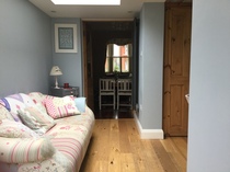
So my awkward living room, which is like a glorified corridor (contains front door, stairs and door to kitchen) is Strong White on the long wall that goes through to the kitchen and up the stairs, and I've kept that colour all the way up. The front door and internal doors and bannisters are Hardwick White, and the spindles are Wevet. Two walls of the living room are in Shoreditch, and the sofas are grey. There is a large bronze mirror on the wall and the cushions are mainly ochre and mustard velvet, with a bit of green and burnt orange thrown in.
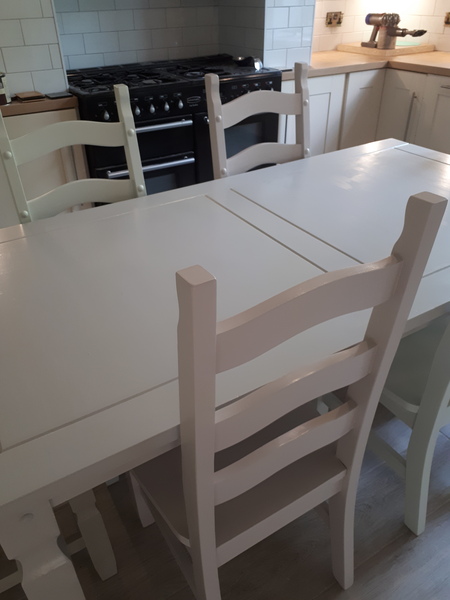
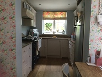
The kitchen kind of reverses that, with its ghastly orange floor. I've painted the units Hague Blue and the walls are currently pale greige with white tiles. I have two large oil paintings hanging in there - very mid century, with lots of orange and blue tones. There is a wooden bench, painted the same greige as the walls, and the chairs I repainted a pale warm grey and recovered the seat pads with a fantastic mustard-and-black retro curtain I had. I'm planning to make the walls a bit greyer to fit more closely with the living area.
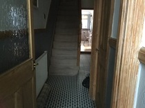
Upstairs, the hall is all strong white and the bannisters and doors are Purbeck stone. My study is in Little Greene Livid - a darker version of Shoreditch - with lots of green and mustard and old oil paintings. The bathroom is the same colour as the kitchen, with mustard and burnt orange highlights.
I haven't been a total palette Nazi in the bedrooms. My room is shortly going to be Soho House (dusty rose) with green accessories, and my daughter's will be dark grey with blush pink. My other daughter rebelled and wanted a cleaner colour, so it's Lulworth blue with wimborne white, blush pink, and lots of rose gold stuff.
So I've tried to have quite a theme running through the house, without being too confined by it. Through all the common areas, there's only five colours (grey, green, blue, yellow, orange) but used in different ratios and intensities.
In your case, I'm wondering - hard to know without photos - whether your main challenge is tying in the living room curtains to the cool greys you're used in the hall? I'd be tempted to go dark in the living room. Would the dark grey you've used in the hallway go in there? Alternatively, use the dark grey in smaller patches (door and trim, or cushions or a rug) and do the walls in a blue-grey-green that kind of leads on from the hall blue, warming it up so it goes nicely against cream curtains. Inchyra Blue? Shoreditch? The kitchen could then be a pale grey?
Or you could just co-ordinate the two rooms more tightly. Maybe picking up some dark grey in each, and painting the walls one colour throughout. Would Hardwick White go with your curtains and your kitchen units?
And then try to have a limited number of other colours picked up as highlights - lampshades, cushions, paintings, teatowels etc. Luckily all my furniture is cheap crap picked up from streetcycle or ebay, which I can customise at will. So I'm painting an art deco stencil on the side of a green wooden chest I have in the kitchen, using Hague Blue, Charlotte's Locks and Rufus by Paint and Paper Library. And my £5 coffee table has lovely barleycorn legs that I may paint a deep burnt orange so it can contrast against the Shoreditch.
Have I blathered on entirely too long now, even for you?!


 Best Christmas wreaths to add some festive fun to your homeNothing quite says Christmas like a festive wreath hanging on your front door. Whether you're after something traditional or prefer a dazzling modern design, here's our roundup of the best wreaths you can buy for Christmas 2022.
 Best Halloween decorations for a spooky haunted houseHosting a Halloween party this October? Whether your vibe is spooky, stylish or scary, here are the best Halloween decorations you can buy in 2022.
 10 best shower caddies for an organised and clutter-free bathroomA shower caddy is a simple and cost-effective way of storing toiletries all in one place whilst keeping your bathroom tidy and chaos-free. Here’s our pick of the best.


 .it seems I've spent years looking at paint colours though and thought that as a result i would know what i wanted when the time came