My feed
Premium

Please
or
to access all these features

Brexit

Charting our nemesis

286 replies

lonelyplanetmum · 19/10/2018 07:12

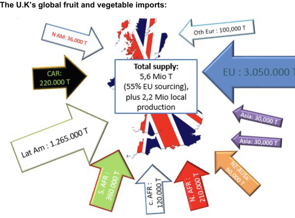
Which chart encapsulates this nightmare for you?

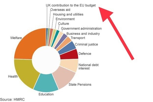
This is the pie chart that I showed my FIL when he was repeating Farage’s drivel. The government’s own 2016 figures showed how statistically insignificant our EU budget percentage contribution always was.

Charting our nemesis
OP posts:
Report
lonelyplanetmum · 19/10/2018 07:16

This is another favourite chart from the FT. This information was always available.

The FT commented that economists' consensus was that EU membership directly raised UK prosperity by about 10 per cent.

Charting our nemesis
OP posts:
Report
lonelyplanetmum · 19/10/2018 07:19

Then we have the charts that document the last two years...

What's your favourite?

Charting our nemesis
OP posts:
Report
Mrsr8 · 19/10/2018 07:27

This reply has been deleted

Message withdrawn at poster's request.

lonelyplanetmum · 19/10/2018 07:32

I think even the ERG cabal think catharsis is 50 years away.

OP posts:
Report
lonelyplanetmum · 20/10/2018 06:28

Here’s another good chart as a quick reference.

The overwhelming consensus is that leaving is bad for the UK.This is taking into account any free trade elsewhere.(From the FT.)

Charting our nemesis
OP posts:
Report
lonelyplanetmum · 20/10/2018 08:08

.

Charting our nemesis
OP posts:
Report
lonelyplanetmum · 20/10/2018 08:16

A picture speaks a thousand words.

Charting our nemesis
OP posts:
Report
lonelyplanetmum · 20/10/2018 08:22
OP posts:
Report
YeOldeTrout · 22/10/2018 11:24

love your charts, OP. Happy to see some more!

Report
lonelyplanetmum · 22/10/2018 13:07

As you asked Yeoldetrout .

Here's a good one! A classic chart that was contradicted by Farage and co and their fictional propaganda.

EU Migrants contributed approximately £2,300 more each per annum to UK public finances (including NHS funding and adult social care etc) than other U.K. residents.

For EU13+ migrants their contribution is £3,700 per capita higher each per annum to the public finances than the average UK adult. ( EU13+ are the EU members before 2004 plus EEA members plus Switzerland. )

Non-EEA migrants contributed around £840 less..

Charting our nemesis
OP posts:
Report
prettybird · 22/10/2018 13:26

So essentially EEA immigrants subsidise the UK citizens! Grin

Report
Mistigri · 22/10/2018 15:40

So essentially EEA immigrants subsidise the UK citizens!

Pretty much inevitable due to the different age profiles alone. Retired people consume more resources than people of working age, and also pay less tax.

Report
lonelyplanetmum · 22/10/2018 16:05

And also use the NHS less.

Charting our nemesis
OP posts:
Report
lonelyplanetmum · 22/10/2018 16:08

I know this is old news to most but I'm collecting a quick reference chart guide!

•Contrary to popular belief migrant groups report much better levels of good health than UK natives.

•We are more likely to report suffering from a long-lasting health problem than immigrants who are Seven percentage points less likely to report a long-lasting condition, and 3 percentage points less likely to state that this condition affects working .

•NHS expenditure on EEA migrants was not significant and was lower than average expenditure on non-EEA migrants

Regarding the effects of immigration on NHS waiting times. Immigration reduced waiting times for outpatients.

Fell free to add a chart!

OP posts:
Report
prettybird · 22/10/2018 16:11

It's also why the Scottish Government said in its White Paper "Scotland's Future" (who know Wink
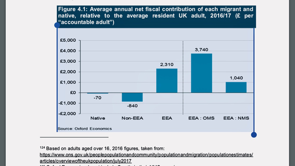
, the one that was produced in advance of the Indyref Shock) said that it would be encouraging immigration because it was required for our economy and society, given our otherwise aging population. Smile

Report
lonelyplanetmum · 23/10/2018 06:22

Hoping a chart a day keeps false rhetoric away.

Charting our nemesis
OP posts:
Report
Mistigri · 23/10/2018 06:27

This is a splendid initiative.

Report
lonelyplanetmum · 23/10/2018 06:32

Thank you. It's good to have a quick reference collection.

Feel free to post your favourite chart! MN regularly tells me I've posted my six images per day when I've definitely only done one!

OP posts:
Report
Mistigri · 23/10/2018 20:58

This is the most Brexity of all Brexit charts

Charting our nemesis
Report
lonelyplanetmum · 23/10/2018 22:34

That chart really says it all doesn't it Mistigri.

Encapsulates the arrogant, conceited vainty. Sheer unadulterated hubris.

OP posts:
Report
lonelyplanetmum · 23/10/2018 22:36

Here's another one.

Nearly 70% of Britons polled by YouGov in 2018 thought that the government was doing a “bad” job at negotiating the country’s future relationship with the EU, and the rest of the world. Reason again for a re-think about the whole mess.

Charting our nemesis
OP posts:
Report
lonelyplanetmum · 24/10/2018 07:54

A picture chart from another thread. We simply can't produce enough food to survive on 'buy British'.

It's not just the 30% of Uk food that is imported from the EU
There is about another 20% imported from the rest of the world - some via the EU.

Charting our nemesis
OP posts:
Report

Don’t want to miss threads like this?

Weekly

Sign up to our weekly round up and get all the best threads sent straight to your inbox!

Log in to update your newsletter preferences.

You've subscribed!

lonelyplanetmum · 24/10/2018 07:56

.

Charting our nemesis
OP posts:
Report
Mistigri · 24/10/2018 08:59

Here's a new one, courtesy of the government. It's about the state of readiness of border infrastructure.

Tl;dr: it's not ready and it is very unlikely to be ready by next March.

Charting our nemesis
Report
lonelyplanetmum · 24/10/2018 09:26

I hadn't seen that one Misti -it's the stuff of dystopian nightmares.

OP posts:
Report
Please create an account

To comment on this thread you need to create a Mumsnet account.