My feed
Premium

Please
or
to access all these features

Mumsnet doesn't verify the qualifications of users. If you have medical concerns, please consult a healthcare professional.

Covid

The Phoney Graph

33 replies

venusandmars · 11/05/2020 15:39

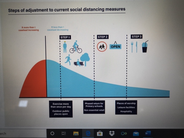
So yesterday UK government provided a 'helpful' graphic depicting the stages to relaxing social distancing (sorry I can't manage to copy it). It shows Rnought increase to 1 - the red phase - then decreasing thereafter. It has 3 stages with provisional dates. The first this week, the second on 1st June, the 3rd on 1st July.

BUT...
Rnought didn't increase to 1, it leapt up way, way higher, and it's taken drastic measures to get it now somewhere indefinable and unstable just below 1.
The graphic makes the assumption that more people returning to work and relaxing some social distancing measures now is going to result in a continued fall in Rnought; that starting to open schools and other shops in June will reduce it further, and that potentially allowing some cinemas, pubs and restaurants to open in July will continue the same trajectory.

Really???

Surely the opposite is more likely to happen. That's what they are seeing in other countries. What happened to following the science? The graphic seems like such a phoney piece of propaganda. Even if people followed the new rules exactly (which they won't) that trajectory of decreasing Rnought is never going to happen. Is it?

OP posts:
Report
LittleMissNaice · 11/05/2020 15:46

I'm not 100% sure which graphic you mean, and I'm not an expert, but I think you might have cause and effect the wrong way round. The changes happen if R drops, R doesn't drop as a result of the changes. That's why none of the dates where set in stone.

Sorry if I've misunderstood your point. Do you have a link to the graphic?

Report
venusandmars · 11/05/2020 16:37

This is the graphic.

I just can't comprehend how as adjustments are made the caseload will continue falling.

The Phoney Graph
OP posts:
Report
merrymouse · 11/05/2020 17:23

I agree Venus, but I think the theory is that implementation of testing, tracking and tracing, should enable more targeted management - the South Korean model.

However, they only just started trialing the app that will enable tracking and tracing and it's not clear when the rate of testing will increase.

Report
merrymouse · 11/05/2020 17:29

The changes happen if R drops, R doesn't drop as a result of the changes.

But none of the things that might cause R to drop are shown on the graph. It's as though R will automatically drop as time passes, even though people are doing things that should cause R to rise.

Report
MarshaBradyo · 11/05/2020 17:31

Interesting hmm need to consider this

Report
sproutsandparsnips · 11/05/2020 17:34

My interpretation was that the measures that ARE continuing, in combination with testing and tracing would hopefully mean that the R0 will remain below 1 and if so then the next step could be taken, not that the relaxation of the measures per se would reduce the R0.

Report
Flaxmeadow · 11/05/2020 17:35

and it's taken drastic measures to get it now somewhere indefinable and unstable just below 1

I seem to remember something being said that it is between .5 and .9 at the moment? Not just below 1

Report
SudokuBook · 11/05/2020 17:37

It's as though R will automatically drop as time passes, even though people are doing things that should cause R to rise

Is it that more people will have had it maybe which means R might drop as there’s less people to infect? (Not a scientist)

Report
thenewaveragebear1983 · 11/05/2020 17:42

Well the graph is made up because the blue section hasn't happened yet, surely? It starts Wednesday when the first changes start. So that is a prediction. It is made to look like the fall is due to the changes but as a poster pointed out above, the changes will only happen if the r behaves as predicted in this graph.

Whether that graph is based on actual data from other countries I highly doubt I don't know. Bozza probably knocked it up on excel during his tea break.

Report
StrawberryJam200 · 11/05/2020 17:42

You're right OP. Infections may fall as these easing happening, they may not. The graph AND his "equation" alert level = R + number of infections are attempts to make imprecise estimates and wishes look scientific!

Report
merrymouse · 11/05/2020 17:44

Is it that more people will have had it maybe which means R might drop as there’s less people to infect? (Not a scientist)

That is the herd immunity theory, but nobody knows how many people have had the virus, how long immunity lasts or how many people need to be infected before herd immunity is acquired. It isn't really a plan.

Report
MorrisZapp · 11/05/2020 17:46

This isn't what they say is going to happen. How many times and how loudly does he have to say 'IF' before people accept that absolutely nothing is set in stone?

That graph represents what they hope will happen, obviously it may not. That's all.

Report
cathyandclare · 11/05/2020 17:48

The graph is the predicted effects if R remains below 1. If it doesn't the changes will not be implemented and greater restrictions will be introduced/reintroduced.

Report
merrymouse · 11/05/2020 17:50

Whether that graph is based on actual data from other countries

Even if it is, the data will assume an app that works and availability of tests. I don't think we will have either of those by Wednesday even before the beginning of June (step 2), but the graph shows a steady drop in R from the beginning of Step 1.

Report
merrymouse · 11/05/2020 17:51

That graph represents what they hope will happen

And they hope this will happen because...?

Report
TheShoesa · 11/05/2020 17:53

I saw that graph on Facebook last night.

As far as I'm aware it is not an official govt approved graphic, it was done by an artist (who than said if anyone shard it would they link it to his artist page or something like that)

Report
merrymouse · 11/05/2020 17:54

It's the graph Boris was using for his announcement.

Report
Neves7 · 11/05/2020 17:56

It’s a rough target not a prediction. If R value is in each range then the rules for that range will be considered and likely implemented.

Report
merrymouse · 11/05/2020 18:01

It’s a rough target not a prediction.

Target based on what?

Report
Mybrowneyedgal · 11/05/2020 18:04

I think that the government knows this graphic is flawed but they are running the risk to try and keep people happy. Then when deaths rise, they can tighten up restrictions again.

Report
TheShoesa · 11/05/2020 18:04

I didn't see the Boris announcement last night and I am clearly gullible as I believed what I read on Facebook!

Report
Flaxmeadow · 11/05/2020 18:15

Is it that more people will have had it maybe which means R might drop as there’s less people to infect? (Not a scientist)

The amount of people who've had is still low. But there will be various ways of working out rates of infection and how many people have had it.

From what I've read its somewhere between 3% and 15% of populations have had it, but that's from research in different country's (China, Italy etc) and different scenarios (antibody testing of large workplace populations or badly hit region's like Lombardy).

As the poster below suggests. It's a new virus and so still a bit of an unknown at the moment

That is the herd immunity theory, but nobody knows how many people have had the virus, how long immunity lasts or how many people need to be infected before herd immunity is acquired. It isn't really a plan

Yes herd immunity isn't a plan, it's an outcome. One that all nations want, eventually. The plan is how and when we reach that immunity but like you say, it's still early days

This isn't what they say is going to happen. How many times and how loudly does he have to say 'IF' before people accept that absolutely nothing is set in stone?

My understanding too of what Boris said, "if"

Report

Don’t want to miss threads like this?

Weekly

Sign up to our weekly round up and get all the best threads sent straight to your inbox!

Log in to update your newsletter preferences.

You've subscribed!

peajotter · 11/05/2020 18:25

The y-axis is not R0. The y-axis is cases.

The red area shows when R0 is above 1, when we have to be stricter in lockdown.

The rest of the graph shows the cases falling due to R0 below 1. Cases can still fall when rules are relaxed due to increased testing and contact tracing.

I’m presuming that the increase in testing means a slight decrease in R0 so they have a bit of room to relax lockdown.

Report
merrymouse · 11/05/2020 18:32

But 'if' is meaningless if you don't know how you will establish that anything has changed or if the likelihood of change is low.

Report
merrymouse · 11/05/2020 18:36

Cases can still fall when rules are relaxed due to increased testing and contact tracing.

But testing hasn't increased significantly and they have only just started a trial of contact tracing on the Isle of Wight.

On the other hand the public has been told that it is likely that we will have reached Step 2 in 3 weeks.

Report
Please create an account

To comment on this thread you need to create a Mumsnet account.