My feed
Premium

Please
or
to access all these features

Join our Property forum for renovation, DIY, and house selling advice.

Property/DIY

Kitchen update help - photos

21 replies

MrsMarigold · 28/09/2016 17:57

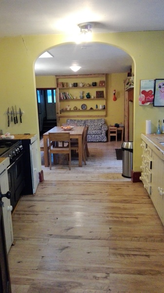
This is my kitchen, we want to update it without losing the charm. Also not keen on the arch and any suggestions about flooring because one half is laminate with concrete underneath other half original with a void underneath, we are reluctant to lose ceiling height as it is already quite low.

OP posts:
Report
MrsMarigold · 28/09/2016 18:00

Photo

Kitchen update help - photos
OP posts:
Report
MrsMarigold · 28/09/2016 18:02

Photo 2

Kitchen update help - photos
OP posts:
Report
lalalonglegs · 28/09/2016 18:35

I agree, I'd square off the arch, curved ones do look a bit old-fashioned, you could have an exposed steel if you wanted to go a bit Shoreditch. I think the cream/custard colour on the walls is making it look a bit dated too as well as the terracotta chimney breast. Imo, blues/teals/greys would look more modern. As all your furniture and the kitchen units are very neutral, it should be easy to update without too much trouble. I like the dining table and bench, I can't see the units terribly well but I'm not mad on the handles. I'd tile the floor all the way through and put lots of pictures on the walls.

Report
wowfudge · 28/09/2016 18:37

Open out the arch either squaring it off or fully opening it with a steel to support what is above.

The furniture in the dining room plus the fireplace pretty much fill it up - if you lost the sofa and had kitchen units in both areas, it would be more coherent. Wall units for additional storage.

The flooring goes the wrong way to me - if it was laid length ways rather than across the rooms, this would make it feel longer and more spacious.

The rooms look quite dark - re-think the lighting, especially in the dining are.

Report
Leax · 28/09/2016 18:47

What's your budget? Also are you changing the kitchen itself or just trying to update look of the rest of the room?
I'd prioritise the units, countertop and floor over the arch if need be.
Boards running lengthways (as poster above mentioned) would help with retaining the charm element. Wide-board semi-solid would look well, cheaper and more hard wearing option would be a good laminate.

Painting the walls and ceiling the same neutral colour would be more contemporary in look and help with reducing how noticeable the arch is, though squaring or removing as suggested above gods options. I'd paint the window frames sand colour.

Report
MrsMarigold · 28/09/2016 19:05

It is very big space, so that isn't an issue, it's almost 10 metres long but quite narrow. Units are hideous and need replacing, I was thinking soft greys and whites, with arch I thought about getting rid of it, it isn't structural, but there is the issue of the steps near the back door. Also would you go for completely different flooring in the kitchen. Also it's cold so that's why I think the previous people went for yellow.

I've been tninking of getting British Standard units.

I agree about the lighting, do you think spots and another sky light.

OP posts:
Report
wowfudge · 28/09/2016 20:05

Not a fan of spots - you could go for track lighting of some description with several lights you can direct to give light where you want and need it.

Report
namechangedtoday15 · 29/09/2016 09:28

I agree with losing the arch, and repainting, that will freshen it up straight away. Is the window frame in the kitchen wooden, or painted? I'd paint that white too.

It looks like the flooring in the dining room is original floorboard, and the kitchen has been laid to match. Personally I like the flooring. If you can, I'd retile the fire surround though, it looks quite dark and domineering.

I'd replace the units too if you could, I wouldn't have wall units because I think it will close in the space especially if its already narrow. I'd remove some of the ornaments you have and the large shelving unit in the dining room, make it more contemporary whilst retaining the traditional feel.

Report
JT05 · 29/09/2016 09:40

If you can, I'd put a sky light in the kitchen. They give lovely 100% daylight, we have one and it makes our narrow kitchen seem much brighter. Get one with an electric opening mechanism.
I agree on the wall cupboard suggestion, they do narrow small spaces. In a previous house we had a similar flooring dilemma and decided, rather than a bad mismatch we put down tiles on the concrete part, it then defined the cooking area.

Report
shovetheholly · 29/09/2016 10:11

Wow, it is a charming space!

Squaring the arch off will make it feel way bigger - if your budget stretches, you could get rid of the dividing wall altogether.

What about levelling off the floor and putting down Amtico or Karndean? Alternatively, you could consider underfloor heating and porcelain, which would make it lovely and cosy as a space. Something like a soft, undercupboard lighting (NOT white) would focus your light where you need it on the worksurface, and give you a warm 'glow'. I know they aren't popular on here, but I do like halogen light spots in the kitchen, especially if ceilings are low and pendants might get a bit in the way.

You can easily get rid of the yellow (which doesn't work for me) - I'd go for cream, which is more heritagey. I would be a little careful with soft greys in a cold space - sometimes I think they can be slightly blue-tinged and make it feel even colder - not saying 'don't do it' but 'think carefully about how you work with the colour to warm it up'.

Report
MrsMarigold · 29/09/2016 10:13

I'm quite keen to lose that shelving thing with ornaments on, it's Victorian but of absolutely no use. There is another Victorian cupboard that I was thinking of keeping, you can't see itin the picture but it's ok. The whole house hasn't been decorated in over 20 years. JT05 I was a also thinking of tiling with underfloor heating because it's cold and the only radiator is tiny.

OP posts:
Report
MrsMarigold · 29/09/2016 12:01

Ok arch has to go, my thoughts exactly. There is a already one skylight but maybe extend it/ get another one. Also with the floor, I was thinking of tiling the kitchen bit and putting in underfloor heating as there is only one radiator in the room. Also had thought on the righthand side of doing a small return with the units to make it less corridor like. Also I'm keen on light work tops in quarts or corian. I'm relying in Dh's negotiating skills and my ability to sniff out a bargain to get it in at a reasonable cost. Also I want to get rid of the Victorian shelving thing that has jugs on because it's bloody useless, but there is another Victorian cupboard I think I'll keep and paint the same colour as the units, veering towards soft sage or a warmish grey.

OP posts:
Report
shovetheholly · 29/09/2016 12:12

If finances permit, I'd spend the money on talking to an architect/technicial and a structural engineer whether you can take out the dividing wall and put in a steel over. You'll then have one big space. Are there two doors into it? It looks like it from the picture? If so, maybe work out whether one could be removed, or widened into patio doors to give you more of a connection to the outdoor space.

BIL and his partner have just spent a lot of money doing up their kitchen which was similar- and I have the feeling the end result would look better if the money had been spent on structure and not on things like expensive units/worktops. They've retained many of the problems of the old space, and though the new range and units do look lovely, it still doesn't feel quite 'right', IYSWIM.

Report
RaisingSteam · 29/09/2016 13:10

I think the room looks OK in terms of circulation as it is. I might layout the two rows of units differently so hob and sink are both on the outside wall with a slightly deep worktop.

Lighting and heating (and ventilation) will make a big difference. I'd look at low energy/LED lighting. There are lots of ways of doing flush lighting that aren't halogen spotlights and are more energy efficient. see here maybe some flush to the ceiling lights plus a few targeted spotlights, and another skylight or big light tubes. Have it so there are several circuits and the room can be bright and practical or a bit more muted in the evenings. If the lighting is good then your greys and whites will look lovely and fresh, you have lots of room to add colour with art/furnishings/details etc.

Can you swap the radiator for a taller one if you take out the arch? Also do you need to insulate under the void if the room is cold?

I like your floorboards so I'd keep them and maybe have a toning tile in the kitchen side that was easy to clean.

Kitchen update help - photos
Report
trickyex · 30/09/2016 22:26

I really like it and think its charming and has personality, it would be a shame to lose these by making it too modern/neutral.
I quite like the two separated areas but would lose the arch. Keeping the areas separate means different flooring will be fine, keep the floorboards and go for ufh and tiles.
New units and worktop with better lighting will brighten it up, under unit lights are good and perhaps track. I had spots put in my kitchen which I never use, far too bright and harsh.
Can you put up pics of the victorian cubboards?

Report
trickyex · 30/09/2016 22:34

A kitchen along these kind of lines might work well for your space
www.remodelista.com/posts/beth-kirby-of-local-milk-kitchen-remodel-by-the-jersey-ice-cream-co/

Report
MrsMarigold · 01/10/2016 08:46

Tricky, I love that kitchen it's just what I had in mind.

OP posts:
Report
Callmegeoff · 02/10/2016 14:06

I love that kitchen too, bit late for me though I'm halfway through a kitchen refit including wall down. You have a lovely space to work with OP agree with everyone else about loosing the arch.

I have a victorian glass fronted cupboard -not sure if its the same as yours but we have kept it and I'm planning to paint or wallpaper the inside. Not sure if that's something you can do?

Report
MrsMarigold · 02/10/2016 19:10

Our Victorian cupboard is very awkward.

OP posts:
Report
RaisingSteam · 02/10/2016 22:07

That's a lovely look - my picture was meant for layout, not for style of units!

Report
Mommasoph30 · 03/10/2016 12:00

kitchen is lush

Report
Please create an account

To comment on this thread you need to create a Mumsnet account.