My feed
Premium

Please
or
to access all these features

Join the discussion and meet other Mumsnetters on our free online chat forum.

Chat

struggling with active views/comments

4 replies

onecolour · 26/09/2016 15:20

I thought the hardest bit of blogging was deciding what to write and then writing regularly on your chosen topic.

Well I find that bit really easy!

The bit I struggle with is getting people to read what i've written and comment and interact with my blog.

It's a popular niche 'Adult Colouring'

I post: reviews, challenges, tip and advice, photos of my own colouring, videos with flip throughs of books, giveaways etc.. so it's a really nice varied mix not just review after review or anything.

I'd love for you to check it out and let me know what 'ooomph' it's lacking

onecolouratatimeblog.com/

OP posts:
Report
RealSLOAH · 01/10/2016 21:11

I think the problem is your static homepage. I would suggest you change it to your latest blog posts.

If it wasn't for the fact that I was deliberately looking for your posts, in order to interact with them, I would probably have closed the window after a brief glance. I knew it was a blog... There's a big tag cloud on the LHS. I can see categories, subscribe, adverts... But there's no obvious blog posts to start reading until you spot the tiny "blog" link on the horizontal menu.

If you aren't willing to change from a static homepage, I would suggest you make your main call to action a little more obvious. HTH x

Report
olderthanyouthink · 02/10/2016 15:24

Constructive criticism...

If I'm honest, you blog looks very... meh and dated (& some bits are flat out ugly- sorry Blush). There are blank areas, all that grey and the logo looks like it came from clip art. It just gives the impression of not being current, and not much effort has gone in, which is a shame because once you get in to the content you realise that's not the case at all. You seem to have posted a fair bit, I hope you keep up the momentum.

Your subject matter is very visual, you should show it off in the best possible way. I think big high quality images taking center stage, maybe in a theme with a layout something like pinterest/instagram, would be more appealing. Also perhaps making some Pinterest friendly type images and sharing them would help?

(I like what you did with the back to black challenge, simple and very pretty)

Report
onecolour · 03/10/2016 13:17

Thanks for the feedback peeps.

I have made some alterations so the front page is now the blog posts and not static

I am also just waiting on a header image and matching social media header images to be created for me - which should be done today/tomorrow

I'll work on the blog background colours and things once that is in place.

What about the menus and things - both sides or just one?

I've changed my PR page and also started doing some guest post exchanges with some other blogs

Also added a facebook page rather than just using my personal fb and got a big giveaway up and running

Keep the ideas and suggestions coming as I am reading them and taking it all on board

Thanks very much for your time and help

OP posts:
Report
olderthanyouthink · 04/10/2016 22:13

Perhaps instead of having all the posts "open" on the home, category, tag, archive pages, they could be mini versions so a user arriving has a few to pick from incase the first one they see doesn't immediately appeal? Something like the attached image (It's really messy because I just knocked it together after the idea of your site got stuck in my head - I'd forgotten how much I like designing sites not just making them, thanks)

Menu should be on one side on home, category, tag, archive pages. Possibly on single pages have related posts down the other side.

struggling with active views/comments
Report
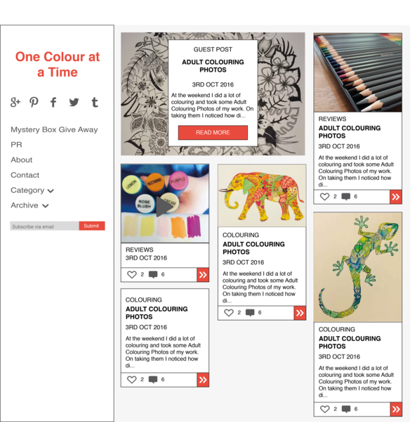
Please create an account

To comment on this thread you need to create a Mumsnet account.